Pineland Farms Dairy Company
Evolving a Great Brand
Services
Team


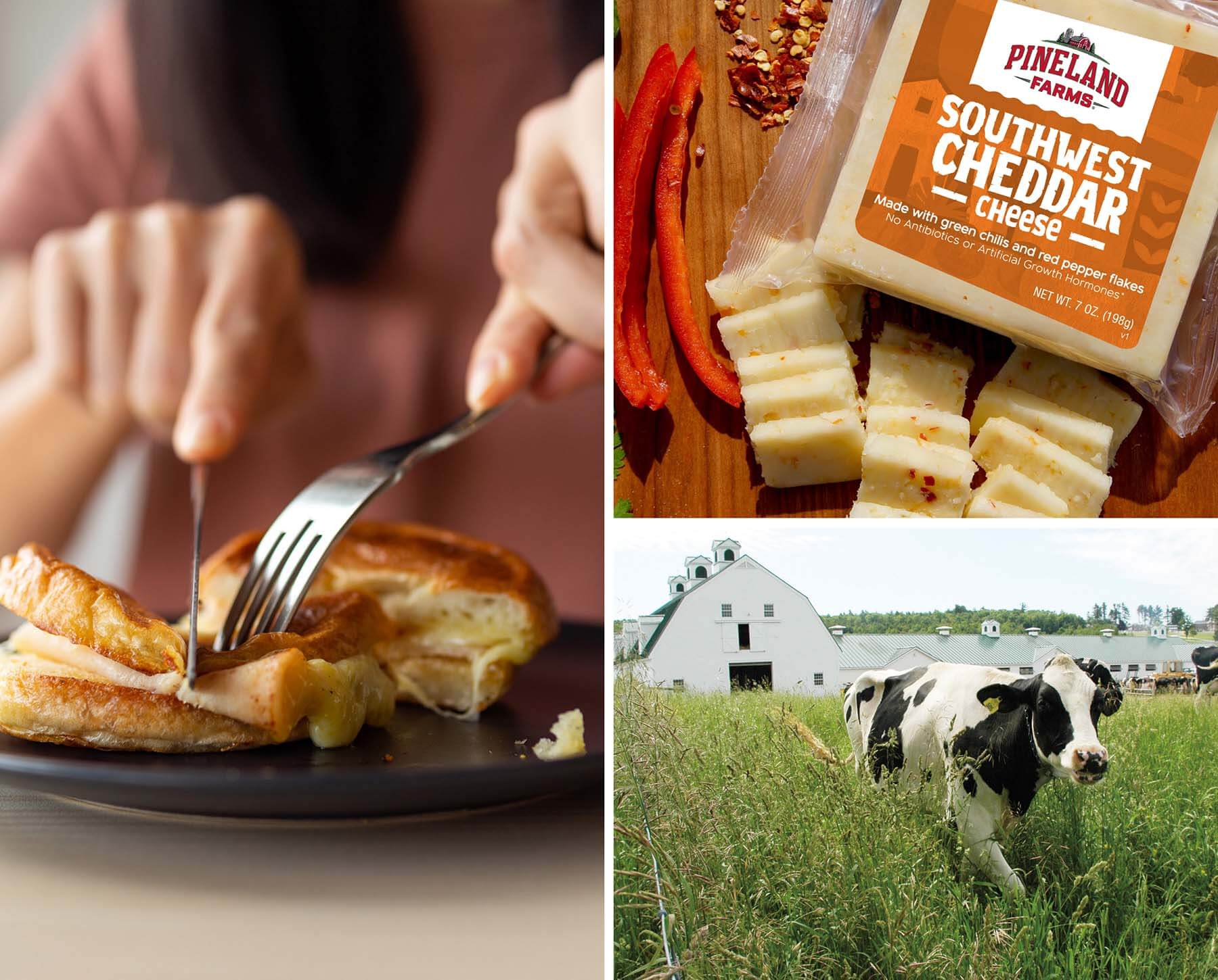
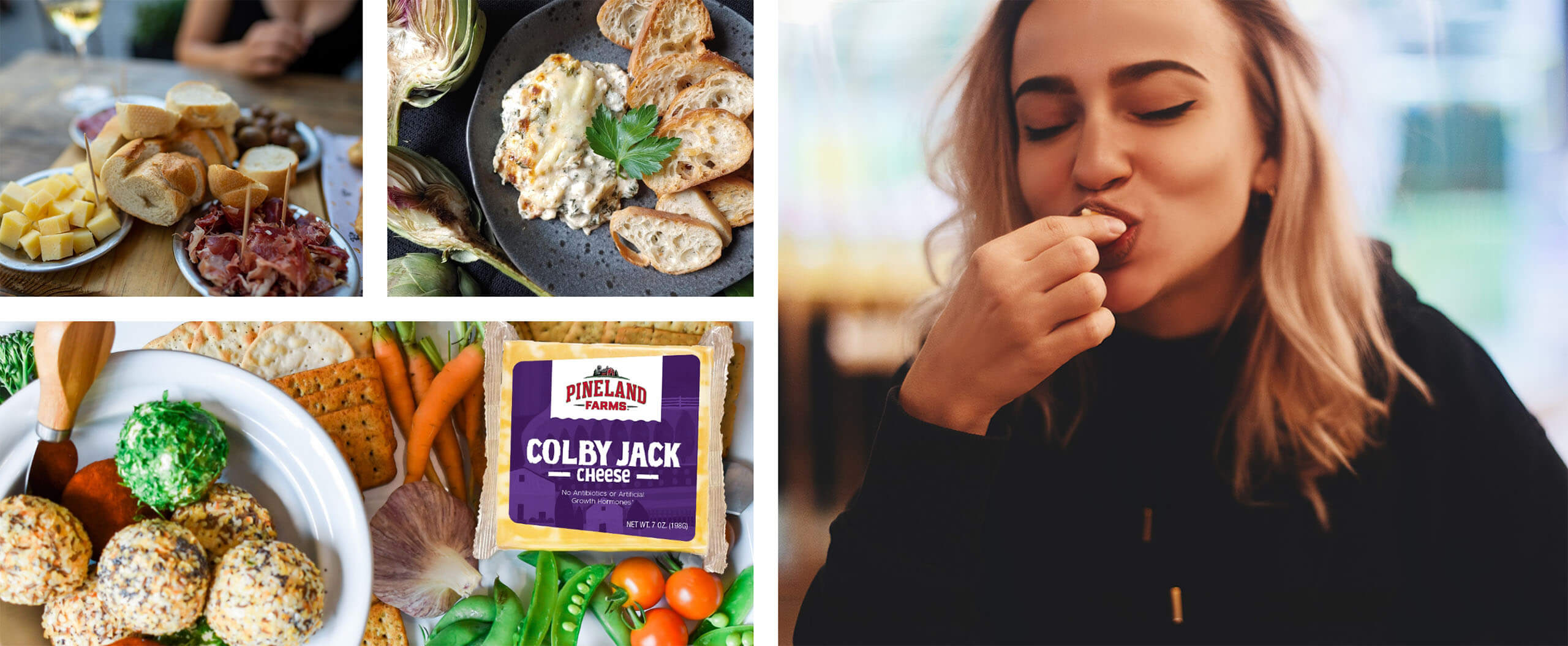
Pineland Farms Dairy Company crafts award-winning cheeses right here in Maine with the freshest milk sourced exclusively from local cows.
But their story goes beyond the cheese aisle; it’s one built on a deep commitment to community, quality, and sustainability. For them, it’s about more than great cheese—it’s about real support for local farms. So, why did they need our help?
The Ask
When head cheesemaker Mark and the team from Pineland Farms came to us, they weren’t looking to reinvent their brand — they were looking to evolve it – and, specifically, to evolve it alongside and in concert with the rest of the organization. Pineland Farms has a well-earned reputation for both quality and a commitment to community. Between the New Gloucester campus, the Natural Meat Company, and a line of small-batch cheeses, they had accumulated the foundational elements of a brand that were second to none.
It was time for their brand to honor that reputation – with packaging at the forefront. Competition was increasing, and “great cheese” alone was no longer enough to stand out in a crowded marketplace. It was time for the Pineland Farms Dairy Company brand, and their cheeses, to show up with more clarity, confidence, and purpose.
The ask was clear: evolve the look without losing their history, work with (and not against) the other business and product lines to serve the larger brand, and do it all in a way that could energize the base and introduce the Dairy brand to new consumers.
The Approach
We immersed ourselves in Pineland Farm’s values and the competitive landscape to understand how the brand could stand out. We carefully considered the market’s trends, what made Pineland Farms in general, and the Dairy Company specifically, unique, and how their community-driven identity could be communicated in a fresh way.
Using that research, we decided on an approach that would balance preservation and innovation—keeping the Pineland Farms name and logo front and center, while creating a more confident visual system that would both resonate with existing customers and command more attention on store shelves.
The Work
What quickly emerged was a series of directions for the refreshed brand – each dialing up unique aspects of the evolution. The goal at this stage was not to design print-ready labels – it was to explore the boundaries of what the evolved brand could be. We then brought these directions to the decision-makers themselves – presenting design and copy to our core audience. This iterative process helped us achieve the perfect balance of familiarity and innovation.
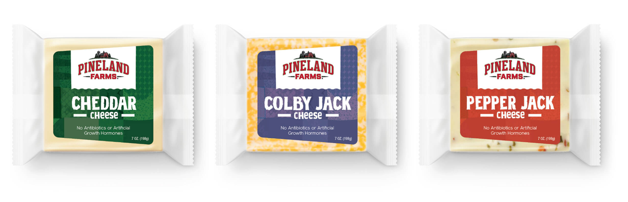
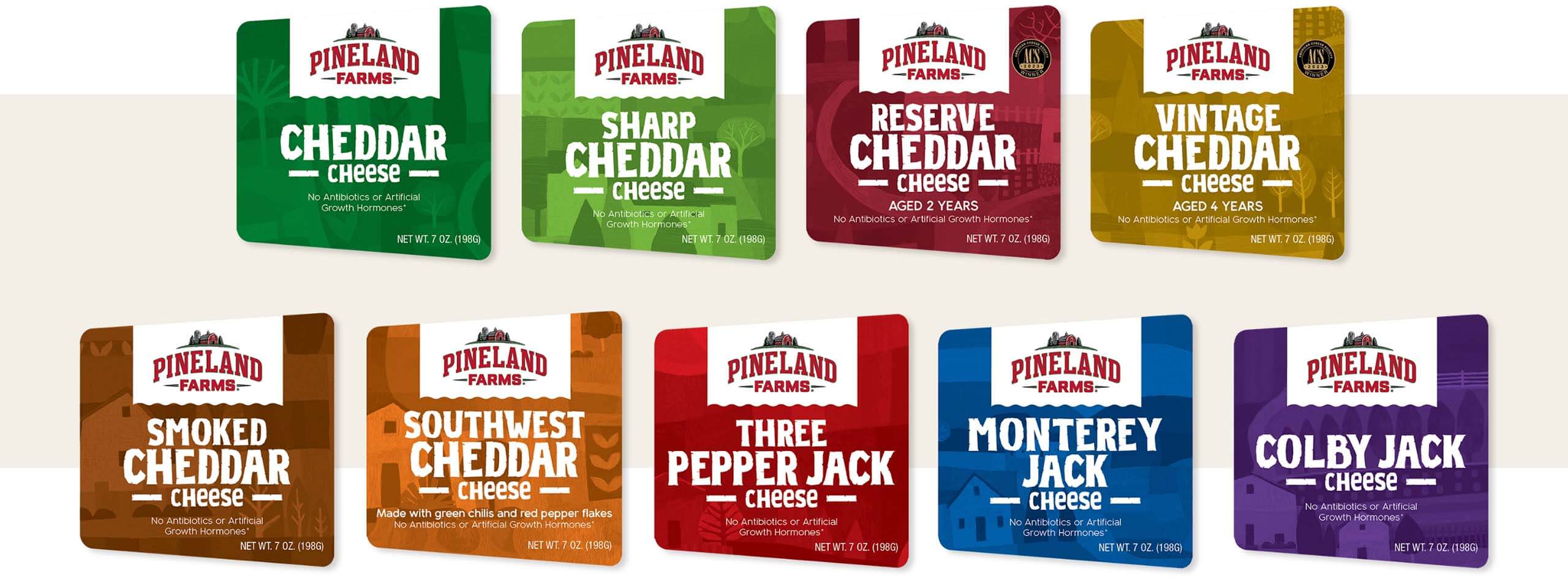
A key outcome was the introduction of a patchwork element that symbolizes Pineland Farm’s deep Maine roots and connection to local farming. This distinctive visual feature helped us build a system that does more with less, evolving the brand while maintaining its authentic core and improving shelf appeal.
The Results
The refreshed packaging has just started to ship, but early signs are strong — internal teams feel proud, retail partners are responding, and consumers see a brand that knows who it is.