Categories:
Whether you’re launching a new product and are designing packaging for the first time, or you have updated your brand and need to rework your packaging to match – the task can be daunting. From branding to claims to nutrition panels and materials, there are so many things to consider when marketing a specialty food brand – and the stakes (aka costs) are high.
To make the most of your investment, take it slow and do your research thoroughly. As they say in construction – measure twice, cut once. Not sure where to start? Here are 5 Do’s and Don’ts we’ve learned in nearly 20 years of package design work.
-
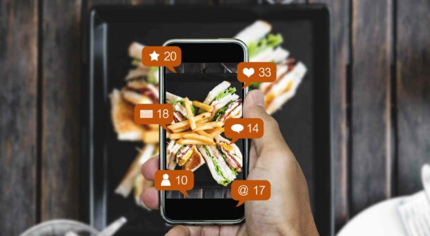
DO make it look delicious.
It’s easy to get so caught up in the design process and all the amazing things you want to say about your product that the actual visual gets lost in the shuffle. Remember that food shoppers eat with their eyes first. Before reading the label, the claims or even the product name – they’re looking for delicious first. It could be the photo, or the product itself (if the packaging allows), or even an illustration. But for the majority of shoppers, no number of claims can make up for a product that doesn’t look delicious. So make this a main focus of your package design and be sure to feature an image that showcases your product in its best (i.e. prepared) form.
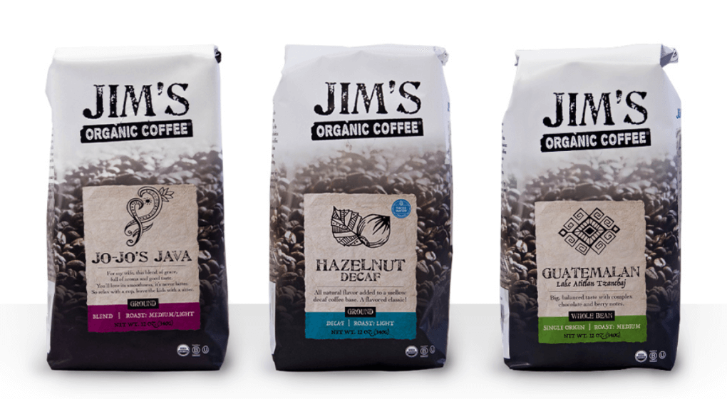
DON’T make it look dated.
Food photography is way harder than it looks – even with a fancy camera. If you don’t believe us just check out a takeout menu with non-professional pictures (or you know, your “foodie” cousin’s Instagram feed), and you’ll see what we mean. Even the yummiest dishes can look totally gross in the wrong lighting or from a tough angle. Because making your product look delicious is so important on a package, a professional food photographer is well worth the investment. They know how to make your food look its best (and always fresh) on camera.
-
DO make it easy to identify.
Everyone wants to stand out – and it’s true that you want your product to “pop” on the shelf. But be careful of making your package too different – to the point where consumers can’t easily identify what it is. For example, most white milk cartons are primarily white or clear. If you designed a milk package that was bright pink, it would definitely stand out, but it might not be obvious that you’re selling white milk, and it could be confused with strawberry milk or some other flavored beverage. Similarly, using too much text or having too many designs on a package can make it hard to read the “statement of identity” which is regulated by the FDA and helps consumers easily recognize what exactly they’re buying.
DON’T violate FDA labeling guidelines.
So, this may seem obvious. But it happens. As we mentioned earlier, the statement of identity (i.e. what the product actually is – milk, butter, ice cream, etc.) is strictly regulated by the FDA, along with a host of other packaging components. Protect your investment (imagine having to pull and re-do your packaging just months after launching it?!) by carefully reviewing the FDA guidelines for your specific food product/category and designing accordingly.
-
DO know your audience and what appeals to them.
What is attractive and/or important to consumers on a package varies widely by consumer segment, and also by product category. It’s important to understand your specific audience, what appeals to them, and what the right hierarchy is. Make sure the information they’re looking for is easy to find and accessible but…
DON’T cover your package in claims.
While it’s important to have the information your customers are looking for on your package (things like organic or ready-to-serve), you don’t want to cover the whole thing in claims. Especially in the specialty foods market, it’s easy to go overboard with all the “free from” labeling. Remember that the claim game changes frequently, and while GMO-free might be important in some categories, its less so in others. Pick and choose which things really matter to your audience and focus on those. Also, remember to keep it real and don’t make pseudo claims like “all natural” just because it sounds good. Specialty food consumers are excellent researchers and aren’t fooled by toothless claims. Stick to what you can truly stand behind and what your brand represents.
-
DO try to choose “green” materials when you can.
Environmentally friendly packaging is good for the earth – and for business. A large segment of specialty foods customers are looking for brands that “do the right thing” – and lessening the impact on the environment of packaged goods is a big step in the right direction. Not only is choosing environmentally friendly packaging good for sales, it can also help your bottom line. As packaging materials become increasingly regulated (both for health and environmental reasons), doing the “right thing” upfront can protect you from having to re-package down the road if a specific material (like BPA, for example) becomes prohibited.
DON’T design just for specialty stores.
All of that said, don’t design your package JUST for specialty or natural/health-oriented stores. In 2017, 82% of total retail specialty food sales were through mainstream channels. Your package design should be geared toward a LOHAS audience but work for a mainstream shopper as well – because more often than not, they’re the same thing.
-
DO consider the shelf space your product will share.
While it’s smart to create a package that stands out visually, you don’t want one that stands out physically – because it likely won’t make it onto the shelf. Make sure you start by touring some of the retail spaces where you’d like to get your package on the shelf. Note the details like height, width, depth of the display, and number of packages you can fit on a shelf. Make sure that your package conforms to these measurements and doesn’t take up too much shelf space. Otherwise, it could be passed over for a package that fits more economically on the shelf. Once you have design concepts in hand, bring them into the store and see how they look next to competitive products in the context of a busy supermarket shelf. You want your package to be easy to identify and “pop” compared to competitors.
DON’T go to market without consumer research.
It’s tempting to skip the research stage of package design, because it’s often expensive and time consuming. But it’s so important to understand how your target audience reacts to the design, claims, images and physical attributes of the packaging. Even if you can’t afford an in-depth study, some informal focus groups, online research panels, store intercepts, or IDIs (in-depth interviews) with people in your target audience can help correct preventable mistakes before going to market.
Designing a new package is an exciting project, and one that will have a lasting impact on your brand. Do your research, partner with an expert if you can, and in the end, go with your gut – your package should represent the vision you have for your product and company.
About Ethos
Ethos is a multiplatform branding agency that develops and executes integrated marketing campaigns across multiple channels for companies inside and outside Maine.
At Ethos, we believe that the most effective way to set a company’s marketing course is by finding its core truth – its ethos. We know that once we discover and communicate that core truth, we can truly make a difference to each client’s unique marketing and business objectives.
With Ethos, you get more than a Maine branding agency. You get a long-term partner whose goals are your goals.
Learn more about the Ethos approach and the work we’ve done for our clients. Want to have a conversation about your brand’s packaging? Contact us!